System settings are the same for all the widgets. They are used to configure a widget’s visibility and access to its data, define what happens, when the user moves or hovers the pointer over the widget, etc.
To change values of the system settings dynamically, you can bind them to context variables.
Events tab
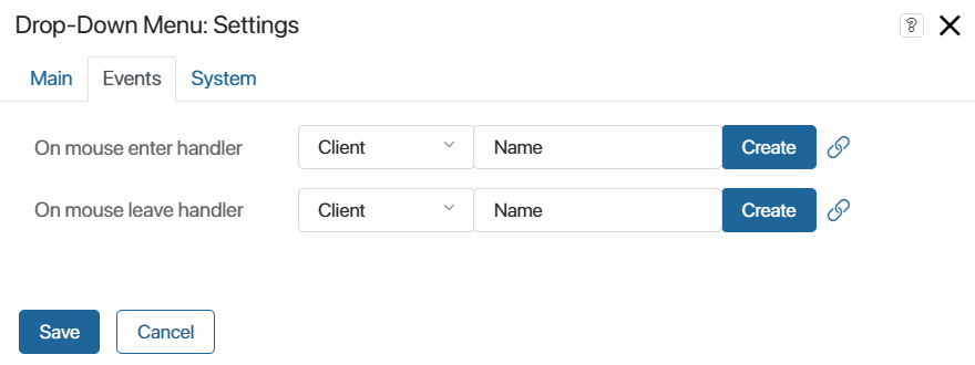
On this tab, you can specify a script that will run after a certain event:
- On mouse enter handler. The script runs when the user hovers their mouse over the widget. For example, a pop-up window with a tip may be shown.
- On mouse leave handler. The script runs the user moves their mouse away from the widget. For example, the tip window shown when hovering over the widget may be hidden.
You can use a variable of the Event type in the context of a custom widget to send event data to the parent widget. This variable will then appear on the Events tab. For more information, read the Send an event from a child widget to a parent one article.
To configure the script to be executed:
- Click the Create button next to the desired event.
- Enter the name of the function and click Open.
- Write the script in the opened Scripts tab.
- The script is saved automatically. To exit the interface designer, click Save and Publish.
System tab
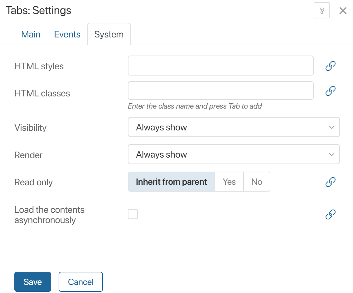
- HTML styles. Here you can specify the CSS styles for the widget. For example, to enter its width.
- HTML classes. Apply CSS styles to the widget that have been configured in the style editor or the Code widget. To do this, enter the name of the custom class in the field and press the Tab key. The styles you configure for this class will determine the widget’s appearance. The same class can be specified in the settings of multiple widgets at once, for example, to set the same background color for different panels on a form.
- Visibility. Allows you to visually hide a widget using CSS styles and HTML markup. This does not remove the widget from the page code. Specify when a widget is shown on the form:
- Always show. The widget is always visible to the users.
- Show conditionally, Hide on condition. Specify a condition for hiding or showing the widget. To do that, bind a context variable to this field. For example, select Hide on condition and bind it to a Yes/No switch variable. The widget will be shown to the user if the user selects No when filling out the form. If the user selects Yes, the widget will be hidden.
- Show for groups. Select user groups that will be able to see the widget. Users who are not included in these groups will not see the widget.
- Always hide. The widget will remain hidden all the time.
- Render. Controls widget data loading onto the page. When hidden, the widget is deleted using the destroy function. Determine when to retrieve widget data for display on the page:
- Always show. The widget is generated and displayed on the page.
- Show conditionally, Hide on condition. Set the condition under which the widget is generated in the page code or the destroy function is called. To do this, bind a Yes/No switch variable to the option. For example, selecting Yes for the Hide on condition option will destroy the widget.
- Show for groups. To generate the widget only for specific user groups, select them in the field that appears below.
- Always hide. The widget is not generated and cannot be seen on the page, including in its code. To visually hide the widget without removing it from the page code, use the Visibility option.
For more information on using the options, see the Comparing the Visibility and Render options section.
- Read only. Configure access to the widget:
- Inherit from parent. The option is used when you use one widget inside of another. For example, you place the Associated items widget into the Column widget that has the Read only setting. If you select the Inherit from parent option for Associated items, users won't be able to edit the list of items.
- If you select Yes, the user won’t be able to edit the widget’s data.
- Select No to allow users to edit the widget’s data.
- Load the contents asynchronously. This option is available for widgets that contain data, for example, Columns, My Tasks, Panel with Header. Enable the option to display content only when the page or app form is fully loaded.
Comparing the Visibility and Render options
Let's look at the differences between the following options:
- Visibility. Controls the visual display of the widget on the page using CSS styles and HTML markup.
- Render. Determines the presence of the widget in the page code. For example, you can configure a widget to be hidden conditionally, so that its data is loaded into the page code and subsequently displayed only under a specified condition.
You can use the Render option in the following cases:
- The input data for the widget to function correctly is not ready yet.
To prevent users from seeing an empty or incorrectly functioning widget on the page, configure it to load into the page code only when all the necessary data for the widget has been received. - For maximum privacy.
You've hidden the widget using the Visibility option, but you don't want users to see it through developer tools. Use the Render option to prevent the widget from being loaded into the page code. For example, select Always hide. - To optimize page load time.
When you select Always hide in the Render option, the initialization function is not called. Data to display the widget is not requested, so the page loads faster.
Using the Visibility and Render options together
If the settings are completed and published, then:
|