This widget helps you to group interface elements on a panel in a collapsed or expanded form.
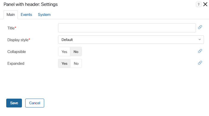
To add the widget to a form, drag it from the side panel of the interface designer to the canvas or use the +Widget button. To learn more, see Form templates. Set up the widget in the window that opens.
Main tab

- Title*. Name of the panel displayed on the form. You can set the title in two ways: by entering it manually or by clicking on the link button on the right side of the field and selecting a String type context variable. With the second option, the panel’s title is determined by the value of the variable.
- Display style*. Select the default or simple title display style.
- Collapsible. With this option, you can make it possible to collapse the panel. You can also click on the link icon on the right side of the field and select a Yes/No switch type variable from the widget or app context. The value of this variable will determine when the panel becomes collapsible.
- Expanded. This option allows you to make the panel expanded by default. You can also click on the link icon on the right side of the field and select a Yes/No switch type variable from the widget or app context. The value of this variable will determine when the panel is expanded.
Read more about context variables in the Context types article.
Events and System tabs
These tabs are similar for all widgets. They allow you to set the widget’s visibility and access permissions, configure the widget’s behavior when the user hovers over it, etc.To learn more about these settings, see System widget settings.
To finish configuration, click Save.
To make the form available to users, click Save and Publish in the designer's toolbar.
Example
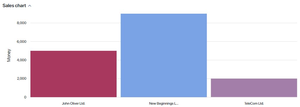
In this example, the Panel with header widget is used to display a bar chart showing sales. It is shown on a separate collapsible panel.

Found a typo? Select it and press Ctrl+Enter to send us feedback