The Text box widget is mostly used for adding headers to pages or tabs. It allows you to add. for example, a short phrase, a comment, the name of a product product, the name of a user, or a contract due date.
To configure the widget, drag it to the canvas from the right panel of the interface designer or click +Widget. To learn more, see Form templates.
Fill out the settings in the pop-up window.

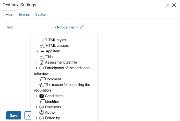
Enter a text in the Text field or click on the link icon on the right-hand side of the field, then click <Not defined> and select a value from the list. This way you can:
- add any field of this app ti the app view form.
- add a process context variable to the form of a start event or task.
- add a property from the Context tab to a page.
The selected value will be displayed on the form as text.
Events and System tabs
These tabs are similar for all widgets. They allow you to set the widget’s visibility and access permissions, configure the widget’s behavior when the user hovers over it, etc. To learn more about these settings, see System widget settings.
To finish configuration, click Save.
To make the form available to users, click Save and Publish in the designer's toolbar.
Found a typo? Select it and press Ctrl+Enter to send us feedback