The widget allows you to display a visual marker on a page, app item form, or task form. For example, an icon of a specific color, short text on a colored background, etc. Users see this marker and pay attention to important information.
The Status widget is a universal tool that allows the system administrator to display not only the status of an app item from its page, but also custom text or an icon on a colored background, as well as the value of a variable bound to the widget.
In the widget settings, there are two ways to set define data display:
- Statically: specify a fixed color, text, icon, and background. This way, the user will see a specific visual accent, such as an exclamation point next to an important field.
- Dynamically: link widget settings to context variables. Then, write a script that will automatically change the widget's content and color based on the values of the variables bound to the widget settings. For example, on a page with a list of orders, users see the current order status, each status being assigned a different color.
The widget can be placed in the sidebar or in the main section of a form or page. To do this, drag it from the right panel of the interface designer to the modeling canvas or click the + Widget button.
Configure visual markers using the Status widget
Take a look at this example of a page featuring the Status widget. On the page, users can see the order status and initiate the business process. Each stage has its own color:
- New: blue.
- In progress: yellow.
- Done: green.
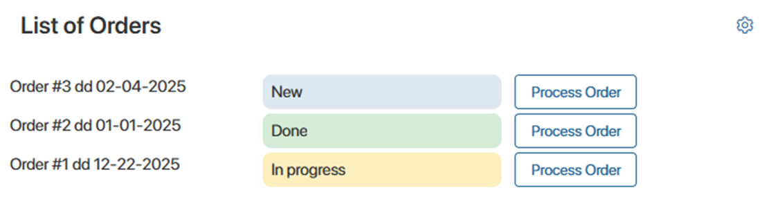
To achieve this, the system administrator creates a script that links the Status widget to data from the Orders app context. As a result, the Status widget will automatically display the current order status and assign the desired background color.
The configuration involves several steps:
- Prepare the page and the app whose items users will interact with on the page.
- Create a custom widget to display order data: title, status, and a button to initiate the process.
- Configure the display of current order statuses using the Status widget.
- Bind the statuses set in the Orders app context to the Status widget settings.
- Display a list of orders and their statuses on the page.
Step 1: Prepare the page and app
In our use case, the Status widget is configured in the Work with Orders workspace. Make sure that in this workspace:
- The Orders app has configured statuses, and the Order Processing business process has been created associated with this app.
- The List of Orders page has been added.
Step 2: Create a custom widget
To display a row with the order title, stage, and a button for processing it on the page, configure a custom widget.
To do this:
- In the settings of the workspace with the List of Orders page, create a custom widget called Order line.
- In the interface designer that opens, go to the Context tab and create a variable with the following parameters:
- Display Name*: Order.
- Property Name*: order.
- Type*: App (one).
- App*: Orders.
- Go to the Template tab and add a Columns widget consisting of three columns:
- In the first column, place the Text Box widget. In its settings on the Main tab, create and bind the Title context variable with the name code to the Text option. This will allow you to retrieve and display the order name.
- In the second column, add the Status widget. We'll cover its settings in more detail in the next step.
- In the third column, add the Button widget. In its settings, fill in the fields:
- Title / Tooltip*: Process order.
- Action type: Start Process.
- Business process*: Order processing.
- Configure Input Parameters: to launch a process instance for a specific order, bind the process and widget variables. In the window that opens, in the column with the process name, specify the process variable that stores the Orders app, and in the Context column, specify the Order variable from the widget context created earlier.
- Save the settings for the custom Order line widget.
Step 3: Configure the Status widget
- Open the settings for the Status widget added in the previous step.
- In the Main tab, fill in the following fields:
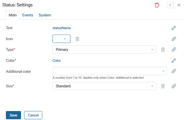
- Text: the word or phrase the user will see in the widget. You can specify specific text or link it to a context variable so that its current value is displayed in the widget.
In our use case, we'll configure the second option. To do this, click the icon, then <Not defined>, and select + Create Field. In the window that opens, create a variable called Status Name with the statusName code. We'll use it later in the script and pass the current order status from the Orders app context to this variable.
 - Icon: select an icon that reflects the visual marker you want to show with the widget: an exclamation point, a gear, etc. In our use case, the icon is not required.
- Type*: specify whether a background is present:
- Primary: the widget is displayed as a colored block with text and an icon, if specified. For our use case, we'll select this option.
- Secondary: only the specified text and icon are displayed, without a background.
- Color*: specify a color for the background and icon. You can choose from the following standard options, each with a specific color assigned by default:
- Success: green.
- Warning: yellow.
- Error: red.
- Information: blue.
- Neutral: gray.
- Secondary: when selecting this option, you can specify one of the custom colors in the separate Additional Color field.
The colors may differ from those specified above if you've changed them using design tokens.
You can also bind a context variable to it to configure a dynamic color change. For example, apply the Success option when the app item is in the Done status, and the Information option when it is in the In Progress status.
In our use case, we'll use the second option. To do this, click the icon, then <Not defined>, and select + Create Field. In the window that opens, save the variable with the default parameters. A Color variable of the Category type will appear in the Context tab of the interface designer. We'll use it later in the script to determine which background color to display in the widget depending on the order status.
- Size*: define the widget size: Small or Standard. We'll leave the default value, Standard.
- In the Events and System tabs, you can configure system settings that are common to all widgets. These settings allow you to manage widget visibility and permissions, customize their behavior on hover, and more.
In our use case, these settings are not required. - Save the Status widget settings.
Step 4: Bind statuses from the Orders app to the Status widget settings
Now, write the client script. With such a script, we will send order data from the Orders app to the custom Order line widget, which includes the Status widget. This information is written to the context variables created in the previous steps:
- Name (name): the order name for the Status widget.
- Status Name (statusName): the order status for the Text parameter in the Status widget.
- Color (color): the background color of the Status widget.
To do this, go to the Scripts tab and add the following code:
async function onInit(): Promise<void> {
if (!Context.data.order) {
return;
}
// Fetch order data
const order = await Context.data.order.fetch();
Context.data.name = order.data.__name; // assign the order name to the context variable `name`
Context.data.statusName = order.data.__status?.name ?? 'Unknown'; // if there is no status, assign the value 'Unknown'
const statuses = order.fields.__status.variants; // get the order status
// Define the color of the Status widget based on the current order status
Context.data.color = order.data.__status?.code === statuses.done.code
? Context.fields.color.variants.success
: order.data.__status?.code === statuses.processing.code
? Context.fields.color.variants.warning
: Context.fields.color.variants.info;
}
To make the custom Order line widget, which includes the Status widget, available for adding to pages and forms, click Save and Publish in the top toolbar of the interface designer.
Step 5: Display a list of orders with their statuses on the page
Now, generate a list of orders based on the created custom Order line widget. To do this, we'll set up a Dynamic List widget. Inside it, we'll place the custom Order line widget configured in the previous steps, which will retrieve the order data.
Follow these steps:
- Open the List of Orders page in the interface designer.
- The Dynamic List widget requires a Table variable to store the order data. Create it in the Context tab with one App (one) column. In this column's settings, select the Orders app.
- Go to the Template tab and add the Dynamic List widget. In its settings, on the Main tab, in the Data array* field, select the created Table variable. Save the settings.
- Place the previously created Order line widget inside the Dynamic List widget.
- Link the widget to a service table column so that data from the Order line widget is passed to the Dynamic List widget. To do this, in the Order line widget settings, on the Main tab, in the Order field, click the icon, then <Not defined> and select Item Table -> Order.
Save the Order line widget settings. - To display orders in the table when the page opens, go to the Scripts tab and add the following code:
async function onInit () {
// Get all items in the Orders app
const ordersListItems = await Namespace.app.orders.search().all();
// Assign a value to a Table variable so it can be used
if (!Context.data.table) {
Context.data.table = Context.fields.table.create();
}
// Create a row in the table for each Orders app item
for (const ordersListItem of ordersListItems) {
const row = Context.data.table.insert();
row.order = ordersListItem;
}
// Assign the value to the table again so the widget updates
Context.data.table = Context.data.table;
}
- To make the customized page available to users, click Save and Publish in the top panel of the interface designer.
As a result, the List of Orders page will display the names of the Orders app items and their statuses. Each status will have its own color.