Starting with version 2026.4, BRIX uses design tokens. Design tokens are variables that store the values of the smallest visual elements of the interface, such as colors, sizes, spacing, border radii, and more.
Design tokens define the visual design of the system and help maintain a consistent look and feel across the interface. For example, instead of using specific HEX color values for text, the system uses tokens such as color-text-primary and color-text-secondary. When you customize your company's visual theme, you can change the values of these tokens. The new text colors are then applied throughout the interface.
This article explains how to use design tokens to customize the appearance of your BRIX environment.
How to use design tokens
You can use design tokens in two ways:
- In custom components. When customizing forms, pages, or custom widgets in the interface designer, you can use design tokens in CSS styles. There are two ways to use them:
- As values. Iinstead of specifying fixed colors, sizes, spacing, and other values, use design tokens. If a token value changes later, all components that use it are updated automatically;
- As properties. To customize the appearance of system widgets, override the values of their design token properties. To do this, add the token to your CSS as a property and assign it a new value. For example, you can change the background of a Button or Information Box widget.
- For the entire environment. When configuring your company's entire visual theme, you can define custom values for spacing, sizes, border radii, and other design tokens. These values are stored in a custom CSS file and applied across the entire system.
Use design tokens in custom components
You can use design tokens to customize the appearance of forms, pages, and custom widgets with CSS. Design tokens are available in:
Both tools work in a similar way. The following example uses the style editor.
Suppose you want to make an info box stand out by adding extra spacing above it and changing its background color.
- In the interface designer, open the settings of the Information Box widget.
- To control which styles are applied to the widget, add the custom class custom-info-box, then click the class name to open the style editor.
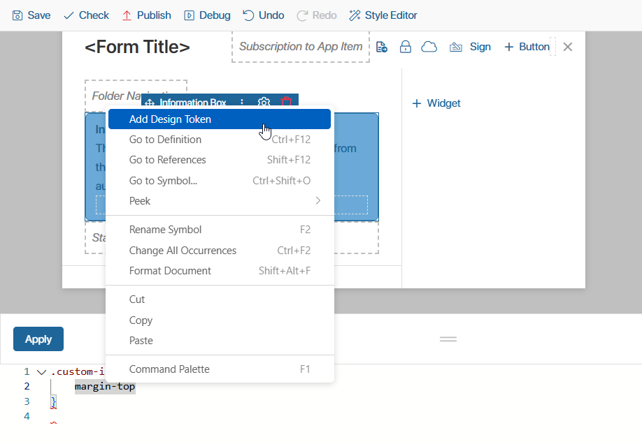
- To add spacing above the widget, use the standard margin-top property and assign its value using a design token. Place the cursor after the property, then select Add Design Token from the context menu
- In the opened window, find the appropriate token. You can filter tokens by:
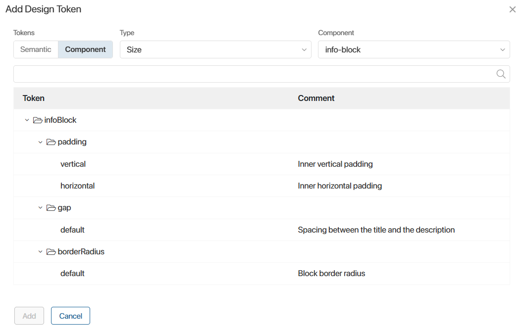
- Usage. Use the switch in the upper-left corner to select the token type:
- Semantic are the general-purpose tokens grouped by meaning. They store colors, spacing, border radii, and similar values.
- Component are tokens intended for a specific interface component. For example, the information box component includes tokens for its background color, text color, padding, and more. Select a component in the Component field to display its tokens.
- Value type. Select whether the token stores a color, size, or font.
- Token name. Search by entering part of the token name.
- Select the token that stores the required spacing value and click Add. The token is inserted into the CSS in the correct format:
var(--el-b-spacing-5x)
where:
- var() is the CSS function used to insert the value of a variable.
- --el is the prefix used to access design token variables in the interface designer.
- -b or -c indicates the token type: semantic or component.
- The information box background color is controlled by a design token. To change it, override the token's value for this widget. Repeat steps 3–5 and add the token with the following parameters:
- Type: component.
- Component: info‑block.
- Location: background > color > default.
- To use the inserted token as a CSS property, remove the var() function in the style editor.
- Assign a value to the property, for example, by using another design token that stores the required color.
The resulting CSS looks like this:
.custom-info-box {
margin-top: var(--el-b-spacing-5x);
--el-c-info-block-background-color-default: var(--el-b-color-special-mint-green);
}
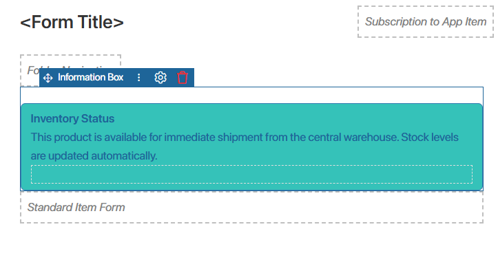
- Click Apply in the style editor to preview the result on the design canvas. The Information Box widget now has additional spacing above it and a new background color.
- To make the changes available to users, save and publish the form.
Configure design tokens for the entire environment
You can also use design tokens to customize the appearance of the entire system to match your company's branding. For example, you can define the border radius and border width for all buttons, drop-down lists, text fields, search bars, and other interface elements.
To define design token values for the entire system:
- Determine the names of the design tokens you want to override. To do this, open any form or page in the Interface Designer, insert the required tokens into the style editor, and copy their names, including the prefixes.
- Create a .css file that defines custom values for the tokens:
:root:not(.non-existing) { /* Increases the priority over the default values */
--el-b-border-radius-base: 8px;
--el-b-border-width-base: 2px;
--el-b-border-width-m: 4px;
--el-b-border-width-s: 2px;
}
- Go to Administration > Theme, and upload the .css file in the Custom styles file field.
- Save the settings.
The new token values are applied to system interface elements throughout BRIX, as well as to custom components whose styles use design tokens.