The widget displays a Yes/No switch variable as a checkbox with a label shown to the right of it. This widget is convenient when the label text is long and you want it to fit on a single line on a form or page.
If a user selects the checkbox in the Checkbox widget, the value Yes is written to the linked context variable.
Configure the Checkbox widget
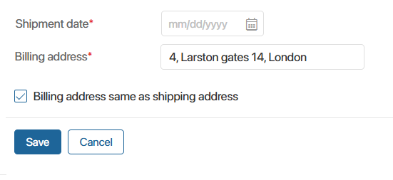
As an example, let’s add the widget to a task form in a business process:
- In the process context, create a variable of the Yes/No switch type named Address. Its value will be used by the widget.
- Open the task form in the interface designer and place the Checkbox widget onto the canvas.
- Configure the widget on the Main tab by filling in the following fields:
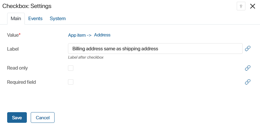
- Value*. Select the Yes/No switch variable that will be displayed in the widget;
- Label. Enter the text to be shown to the right of the checkbox;
- Read only. Enable this option if you want to display a value that was filled in earlier. In this case, the value will be available for viewing only.
For example, during a process an employee receives a task and confirms their agreement with company policies using a Yes/No switch. The selected value is saved to a context variable. To display this information in the employee profile, add a Checkbox widget to the form with the label Employee agrees with the company policies. Depending on the decision made, the checkbox will be selected or not. - Required field. Enable this option if the user must select the checkbox, for example on a task form used to confirm that a document has been reviewed.
- On the Events and System tabs, you can configure system settings that are common to all widgets.
- Save the widget settings.
- To make the configured form available to users, click Save and Publish on the top panel of the interface designer.