You can adjust the table design and functions which are available for users when working with the table. To do this, in the app form settings, select the Table-type field and click Table Settings.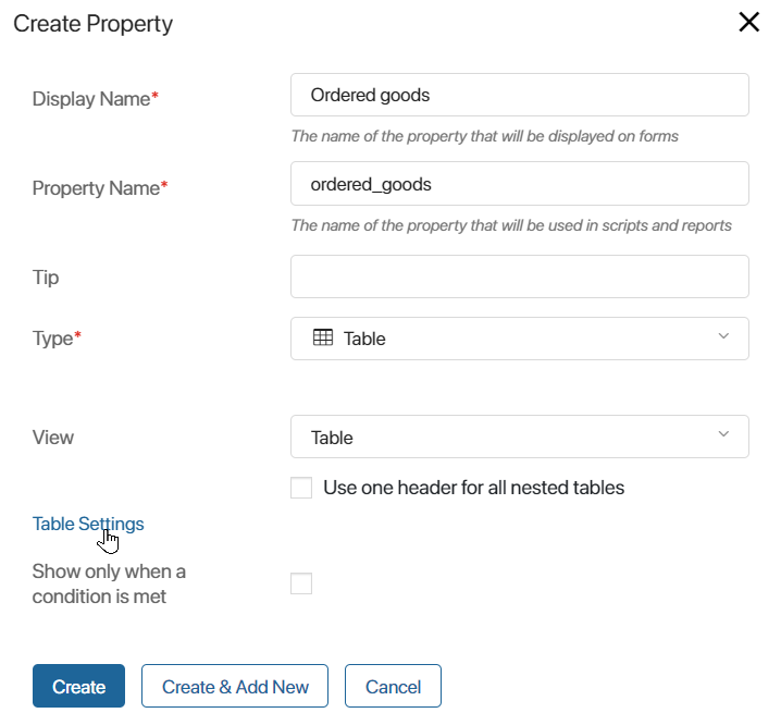
In the window that opens, you can:
- Set general table parameters. Adjust row width and height, manage numbering, data grouping, etc.
- Configure table columns display. Define the order of columns, their width, data visibility, and whether fields are required. For each column, you can specify a title, sorting method, and other parameters.
General settings
General settings are applied to the whole table. The following options are available:
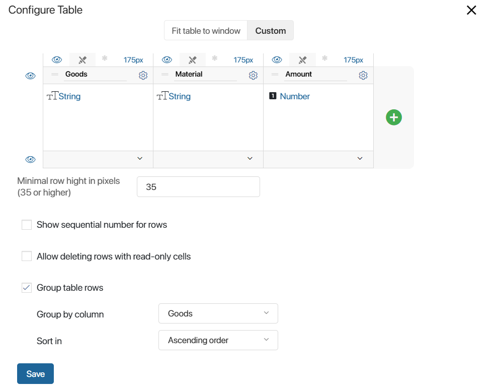
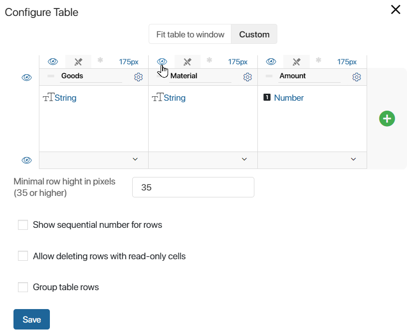
- Fit Table to Window or Custom. Select Fit Table to Window if you want the table to stretch across the width of the page. Column sizes will be percentages of the total table’s width. Select Custom to set a fixed pixel width for each column. The total width of the table will equal the sum of the column sizes.
- Minimum row height in pixels (35 or higher). To align the table, set the height of its rows. The minimum value is 35 pixels.
- Show sequential number for rows. A column for the row’s number will appear in the table. Numbers will be filled out automatically.
- Allow deleting rows with read-only cells. Enable this option to let users remove rows even if the table includes read-only columns. Let’s say there are read-only cells in the Order details table. These are the cells that data from the Orders app is passed to. The rest of the data in the table is entered by the sales rep. If the option is enabled, the sales rep will be able to delete a row in the table, for example, if the data is incorrect.
- Group table rows. This option allows structuring data in the table and displaying it in a more convenient way.
- In the Group by column field, specify the column that rows need to be grouped by.
- Use the Sort in option to place groups of cells in ascending or descending order. If you group items based on a String type field, items will be sorted alphabetically.
Note that if the Sorting option is enabled for a column, you are not allowed to group rows. In the notification that appears, select the option that you want to keep.
- Show new table version. It allows you to apply the updated table appearance and advanced functionality. Starting with system version 2026.1, this option is enabled by default. In earlier versions of BRIX On‑Premises, enable it. Additional options will become available in the table settings.
- Disable adding rows. Enable the option to prevent users from adding rows while filling out the table in the new version.
- Show number of rows. Enable this option to display the total number of rows in the upper left corner of the table.
- Enable pagination. Enable this option and choose how to display large amounts of data in the table:
- Paginated. Data is spread across multiple pages.
- Load on scroll. This option is available when row grouping is disabled. Records are loaded as you scroll down the table.
In the Rows per page* field that appears, specify how many rows will be displayed in the table on each page or per scroll.
Column settings
For each column, you can set:
Width
Depending on the Fit Table to Window/Custom option, a column’s size is set either as a percentage of the table’s width or in pixels. To set the custom column width, drag the column’s border.
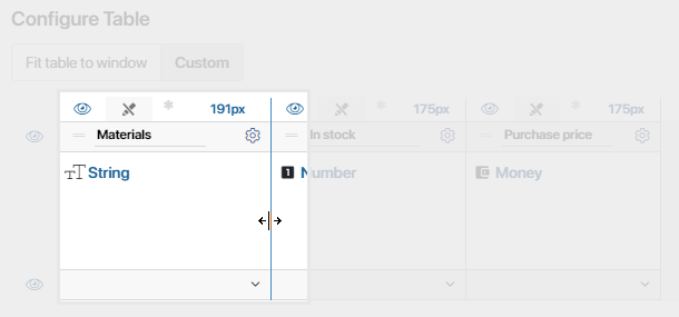
A column’s width can also change automatically to match the width of its content. To enable this option, click the value of the column’s width and select one of the following options:
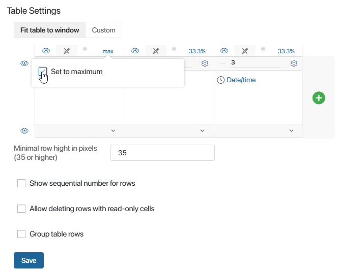
- Set to maximum. This setting is available when the Fit Table to Window option is selected. The column will be as wide as possible, limited by the width of other columns. When you select this option, the width’s value will change to max.
- Set to minimum. This setting is available when the Custom option is selected. The column’s width will be equal to the size of the longest item in its cells. When you select this option, the width’s value will change to min.
Design
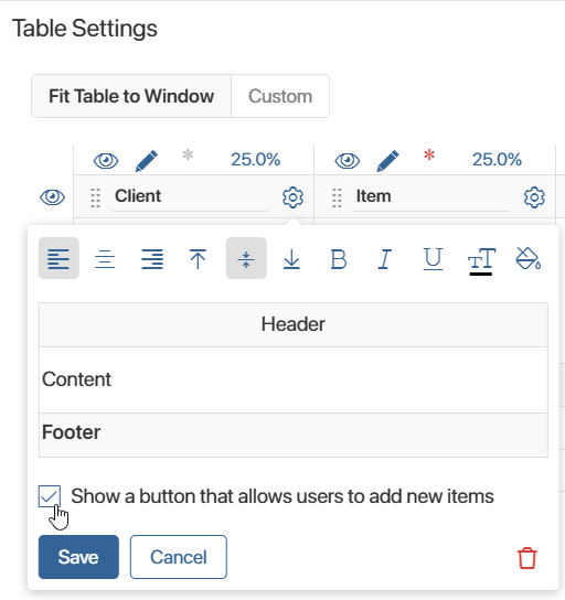
You can apply a background color to columns, change the text’s alignment or font color, and make it underlined, italic, or bold. To do that, click the gear icon next to a column’s name. In the pop-up window that opens, switch between different options to format text the way you want.
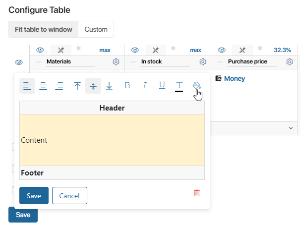
Visibility
You can hide the headers and footers of all the columns in the table. To do that, click the  icon on the left of the table. To make a hidden element visible again, click
  .
.
Read only and Required flags
You can configure how data is added in the table columns using the following options:
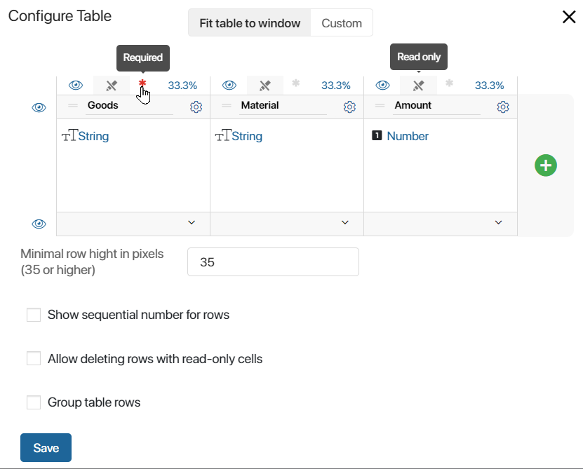
- Read only. Click the
 icon in the row above the column header to prevent users from modifying data in that column.
If the table contains columns that are read-only, users cannot delete rows by default. To change this behavior, enable the option Allow deleting rows with read-only cells in the table settings. - Required. Click the asterisk icon to prevent users from saving changes until all cells in the column are filled in. To remove the requirement, click the asterisk again.
For more details on configuring table display in the advanced mode of form settings, as well as in widget, page, and process task forms, see Customize table display on different form types.
Sorting
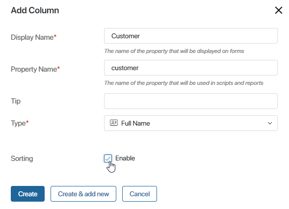
You can sort data in columns in ascending and descending order, as well as alphabetically. Sorting is only available for the following types of fields: Number, Date/Time, Money, String, Users, App, Phone number, Full Name, and Email address.
To enable sorting for a column, check the Sorting box when you create or edit it.
Note that sorting is not available if you use the Group table rows option. In the notification that appears, select the option you want to keep.
When you enable sorting, you can open an app item’s view form and click the corresponding column header. Cells will be sorted in the ascending order. If you click the header again, they will be sorted in descending order. Another click will reset the order of cells.
New table version features
Starting with system version 2026.1, advanced functionality with additional options and an improved appearance is applied by default.
To use changes in earlier versions of BRIX On‑Premises, enable the Show new table version option in the general settings. The option becomes available after enabling the front_enable_vtable feature flag. For more details, see Modify BRIX parameters.
In the new table version, users have access to the following features:
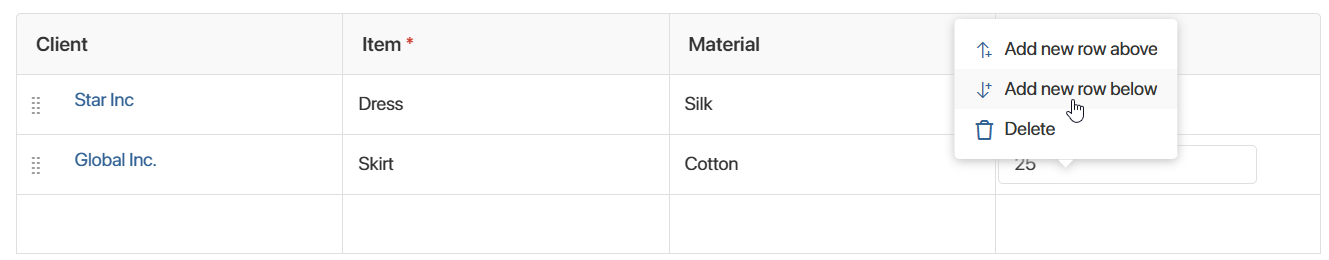
- While filling out the table, users can open the row context menu to add rows above or below the current one, or delete the row.
In the table settings, you can also prohibit users from adding new rows.
- In columns with the App type, users can not only select an item in a cell but also create a new one using the + Create button. To enable this, select the Show a button that allows users to add new items option in the column settings.
- You can can change the order of rows within a table using drag-and-drop. To do this, hold the
 icon in the row header and drag the row up or down.
If row grouping is enabled, rows can only be moved within the same group. Moving rows between groups is not available. - If a table contains a lot of data, you can view it by switching between pages or scrolling down. The system administrator configures the data display method in the general table settings.
- By adding a Table variable to a form template in the interface designer, you can bind a script to user actions with specific table data. For example, you can automatically fill in certain table cells when an employee enters values in tracked cells. For more information, see the article on setting up table events.