The following items are used to group information on external portal pages: Header, Left and Right panels, and Footer. You can place widgets inside of these items.
On the main portal page created from a template, all items are added by default. In this case, the Header contains the customized Page header widget, and the Left pane contains the Portal navigation widget.
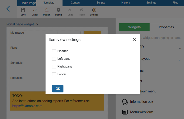
Configure the display of items
You can control the display of items both on empty pages of the portal and on pages created according to a template.
To do this, open the page in the interface designer and then click Settings on the top panel. In the opened window, specify which items should be included in the page and click OK.

Configure items
After adding items to the page, you can change their system settings. They allow you to control visibility and access, customize the behavior of items when hovering the cursor, etc. You can read more in System widgets settings.
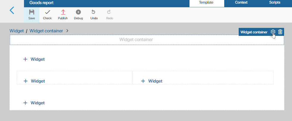
To access the settings, select an item and click the gear icon.

You can also remove an item from the page. To do this, in the system settings window in the upper right corner, click on the recycle bin icon. To return the deleted item to the page, go to the display settings as described above.
To finish configuring the items, click Save and then Publish in the top panel of the interface designer.
Use case
The following widgets have been added to the page items in the example: Page header widget, Portal navigation widget and Text widgets with workspace instructions and company signature.

Found a typo? Select it and press Ctrl+Enter to send us feedback