Starting with version 2026.4, the interface designer includes the style editor. This tool lets you customize the appearance of widgets—such as colors, fonts, sizes, and spacing—using CSS.
The style editor provides the following features:
- Code completion and error checking while you write CSS.
- Style isolation within the current form, page, or custom widget. Unlike styles defined in the Code widget, standard CSS properties in the style editor affect only the component being customized and do not change the appearance of surrounding interface elements.
- Preview of styles on the design canvas, allowing you to review changes before publishing.
To learn about other ways to customize the appearance of interfaces, see the article about applying styles in interfaces.
Open the style editor
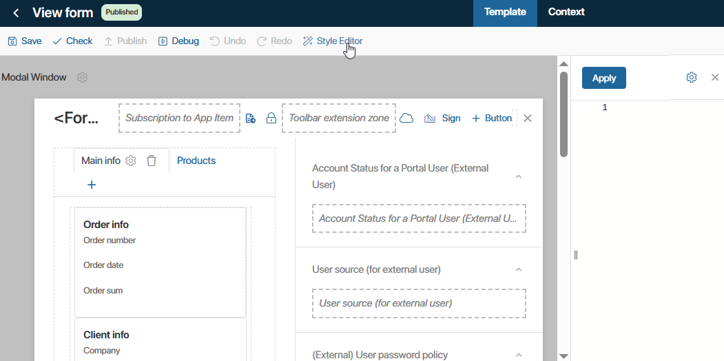
To start using the style editor, open the interface designer, go to the Template tab, and click Style Editor. A code editor panel opens next to the design canvas.
You can customize the editor by changing:
- Editor position. place the panel to the left, right, or below the design canvas by clicking the Settings icon and selecting the desired option.
- Editor size. Resize the panel by dragging the resize handle on its border.
Style widgets
To define a widget's appearance, assign it a custom CSS class. The class determines which styles are applied to the widget. After that, define the styles in the style editor using CSS.
The following example shows how to assign a class to a Container widget that contains buttons and customize its appearance:
- In the interface designer, open the Container widget settings.
- On the System tab, create a custom class. In the HTML classes field, enter a class name, for example, buttons-panel, and press Tab on your keyboard.
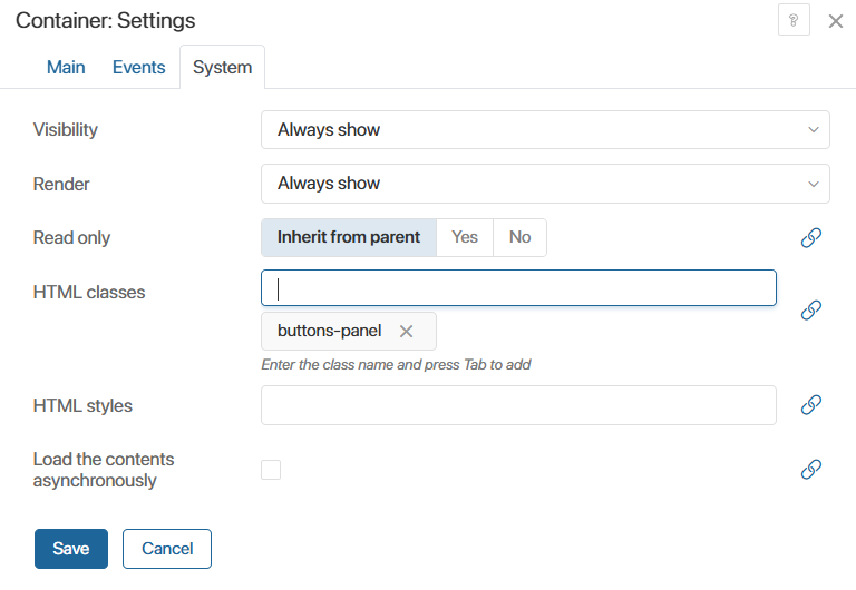
- Click the name of the newly added class to jump directly to the Style Editor. A CSS rule for that class is created automatically.
- Define the styles for the buttons-panel class using CSS.
We recommend using design tokens instead of fixed property values to maintain a consistent appearance throughout the system.
начало примера
Example of applying styles
To set the widget's width, padding, border radius, and background color, add the following CSS:
.buttons-panel {
width: auto;
padding: var(--el-b-spacing-x) var(--el-b-spacing-2x);
margin: var(--el-b-spacing-3x);
border-radius: var(--el-b-border-radius-3x);
background-color: var(--el-b-color-background-accent-delicate);
}
конец примера
- In the style editor, click Apply. The new style is applied to the Container widget because it has the buttons-panel class assigned.
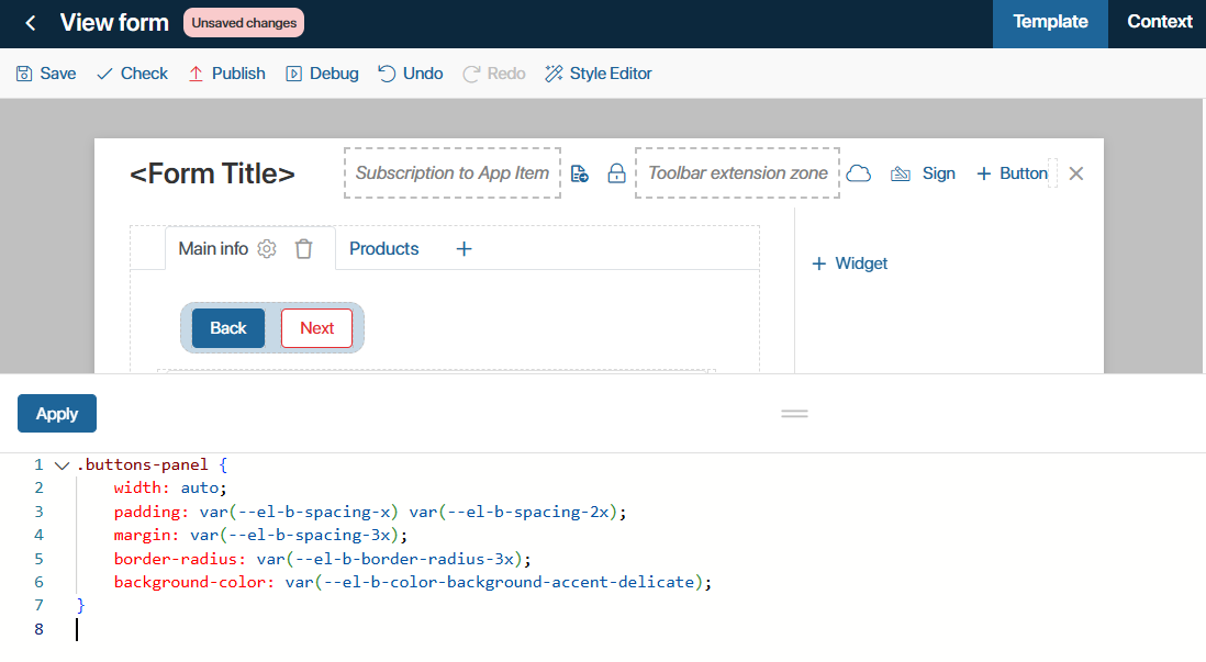
- To make the changes available to users, save and publish the form.
You can apply the same style to multiple interface elements by assigning the same custom class to several widgets.